Studio
Designers and inspiration
Initial inspiration
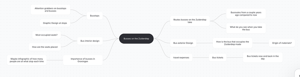
We chose the busses on the Zuiderdiep because they’re a very prominent part of the street view. Whenever you take a trip on the Zuiderdiep, you’ll always encounter a bus.
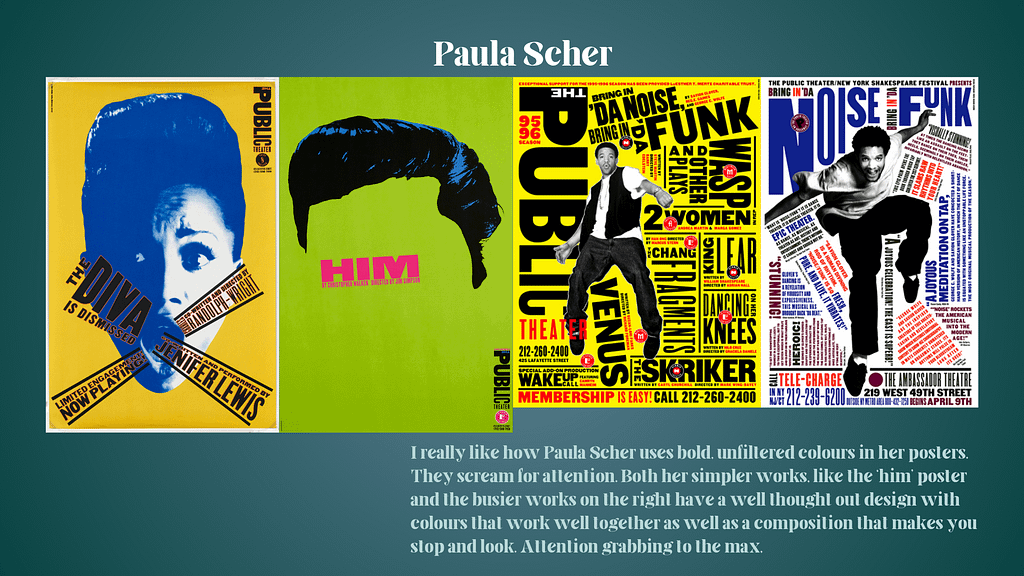
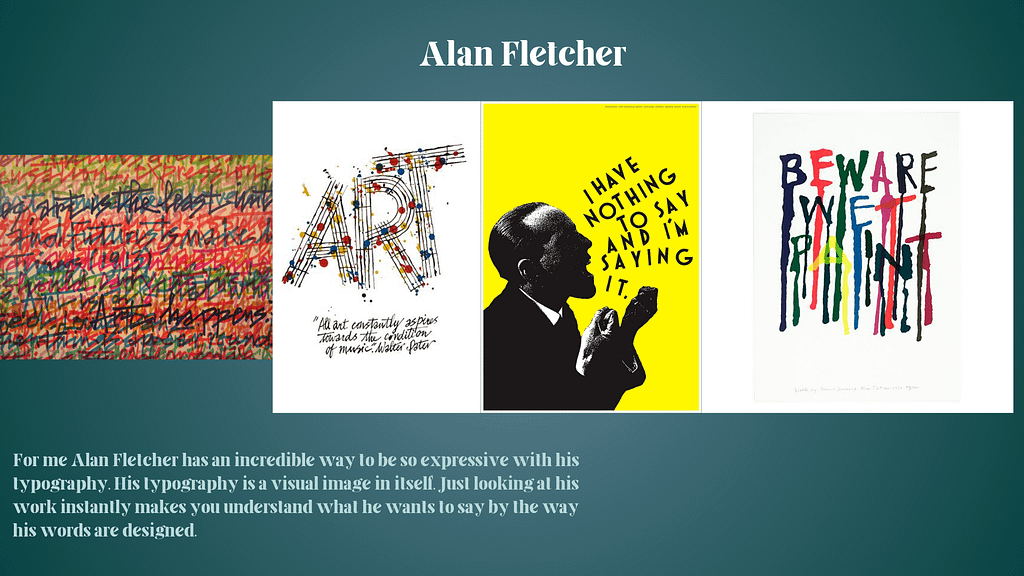
5 Designers
Lab
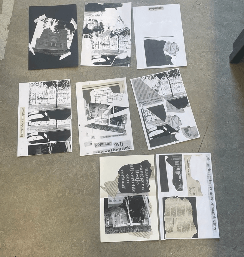
Black and white spreads
This is what all the spreads look like layed out on the ground. When I made them I didn’t
Theory
Ideas for circulation of images
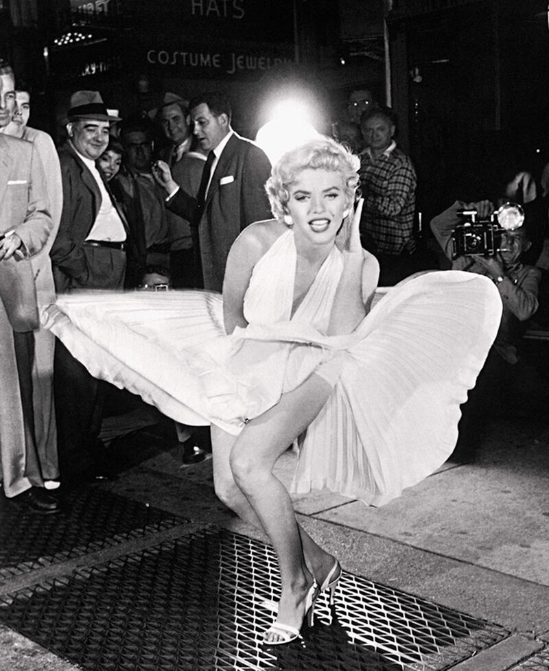

These are some ideas for now, but they’re quite well known and classic so I think I’ll keep looking and if I don’t find anything I will come back to these.
Workshop
Photography & Lithography
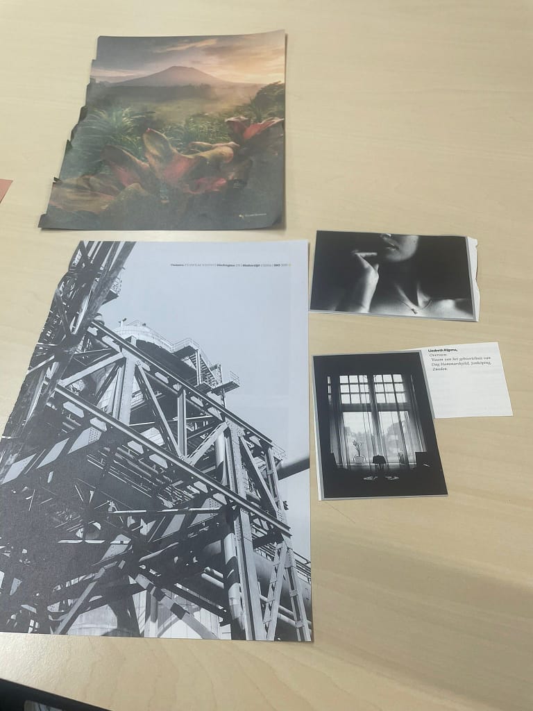
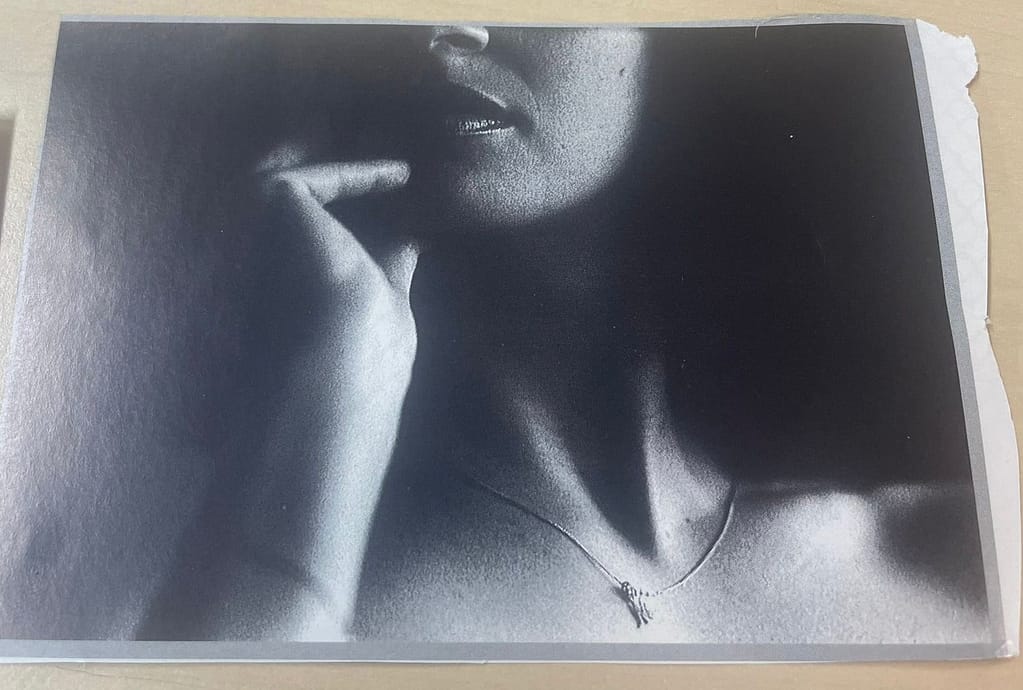
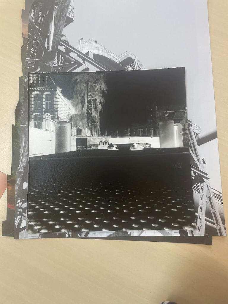
Overall assignment
Progress Week 1
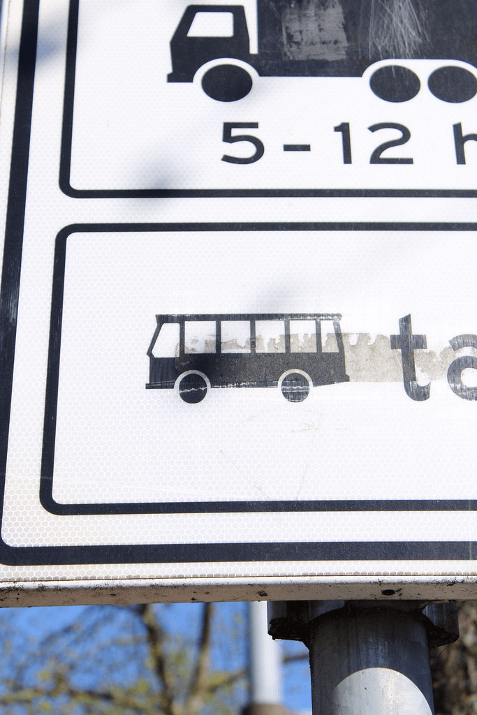
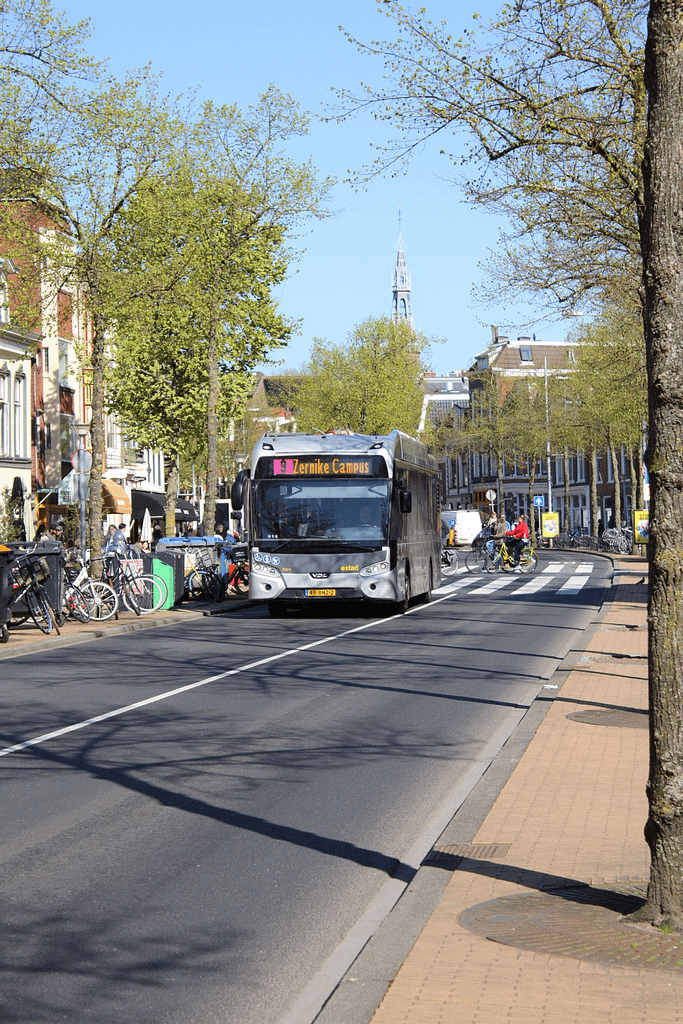
First spreads I wasn’t sure what to go for, so I just started trying something. I took 2 pictures, one of the bus sign posted next to the road, and a background picture of an arriving bus on the Zuiderdiep. I think it’s mostly an introduction page meant to be attention grabbing if anything trying to get that subjective feel?
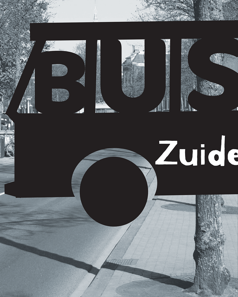
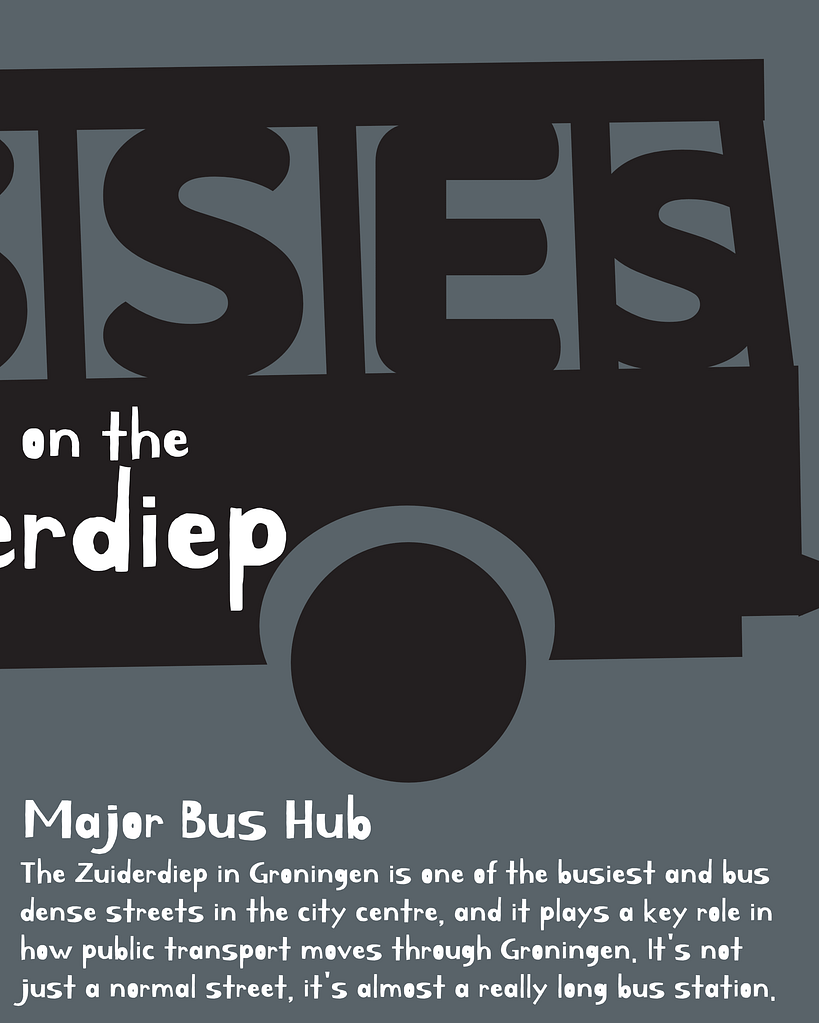
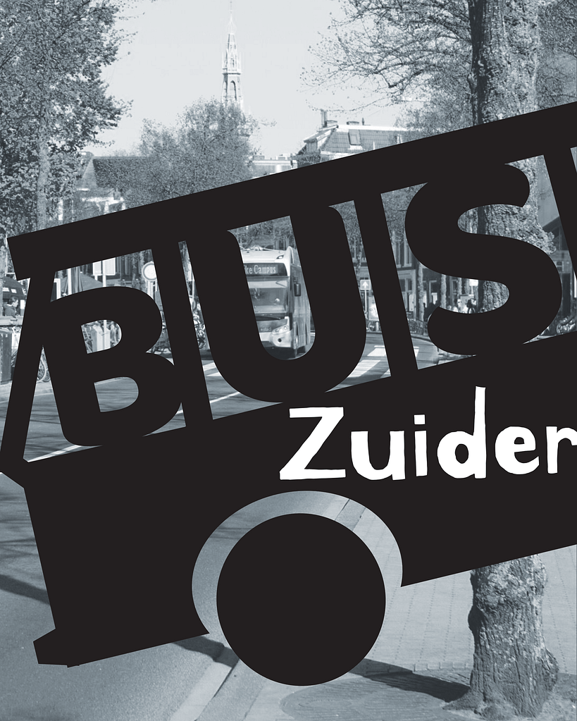
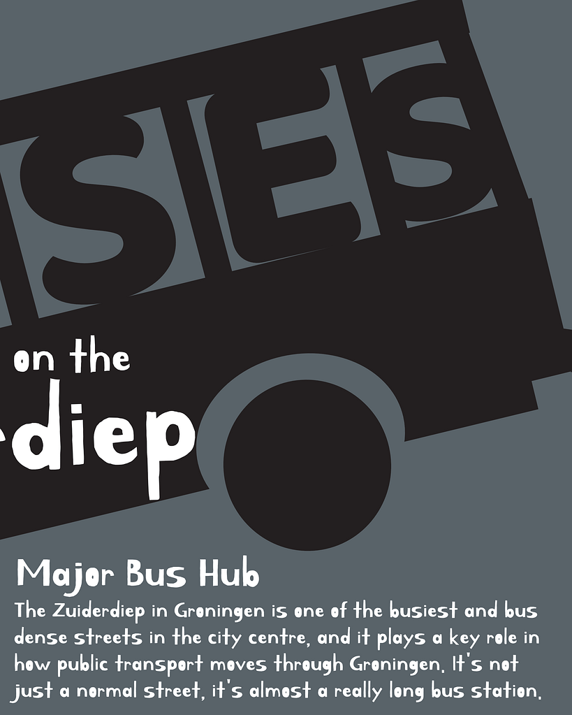
I know the goal of week 1 was to make our spread mostly black and white, but I decided to add just a little bit of colour. Otherwise I think it would look very boring and uninteresting
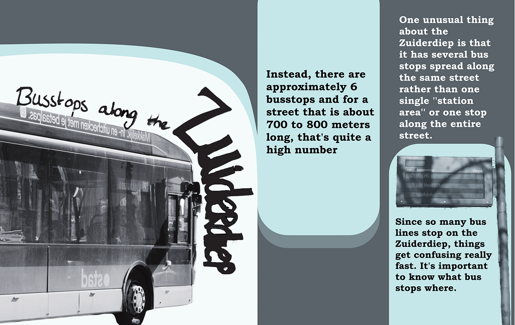
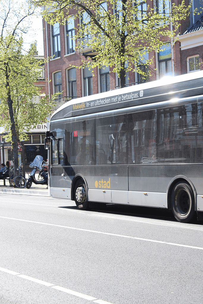
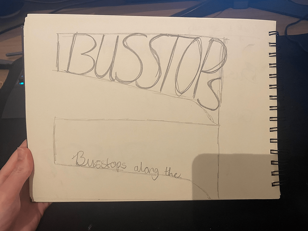
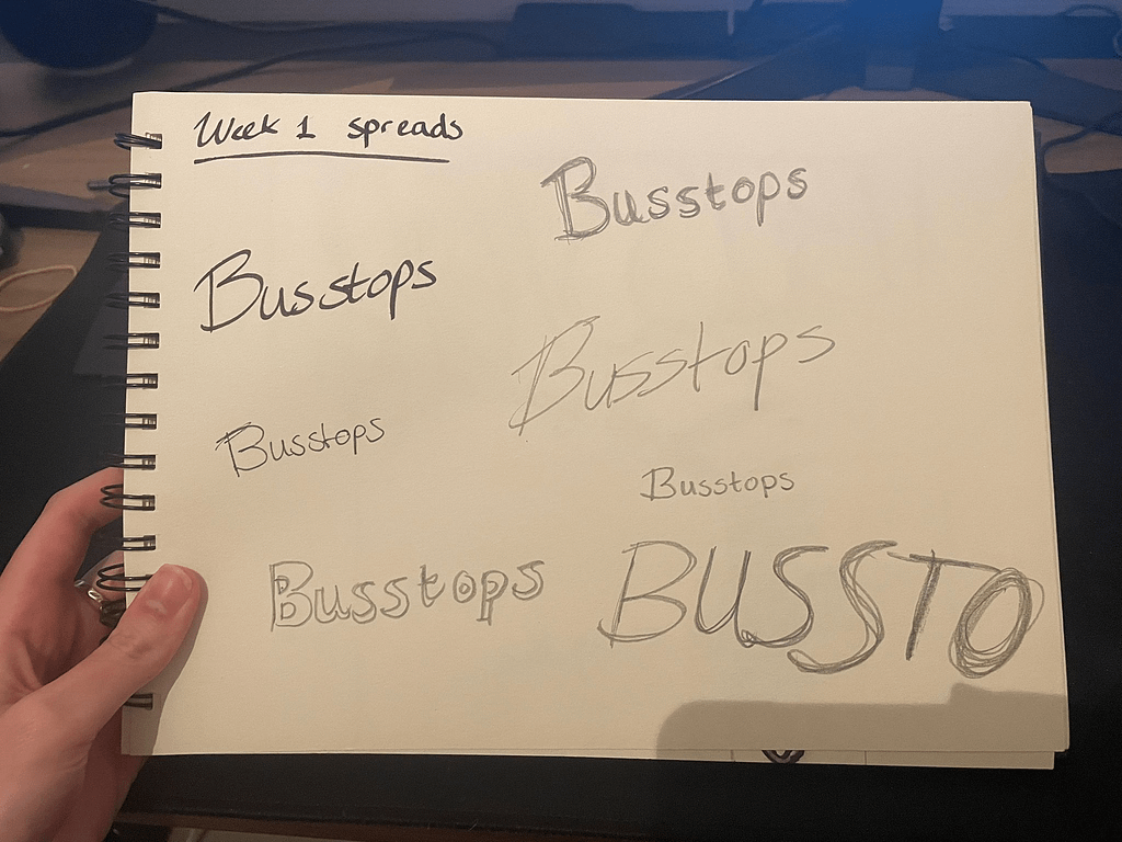
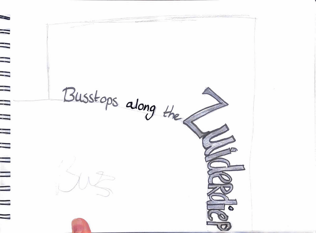
In the end I did like when the text was hand written, so I tried to add it into my spread, but it proved quite challenging, so it can definitely use improvement.