Lab
colour spreads
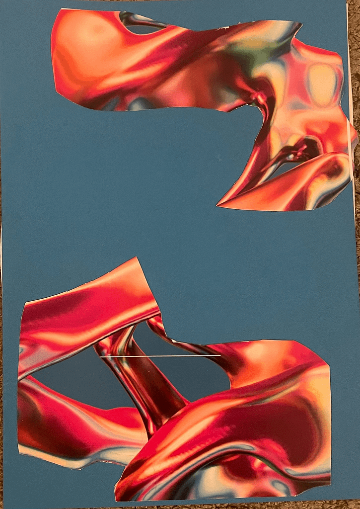
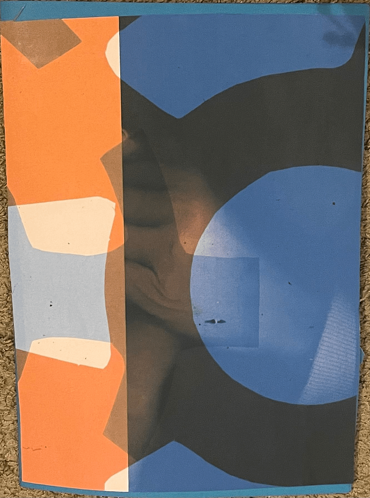
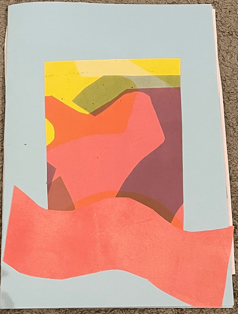
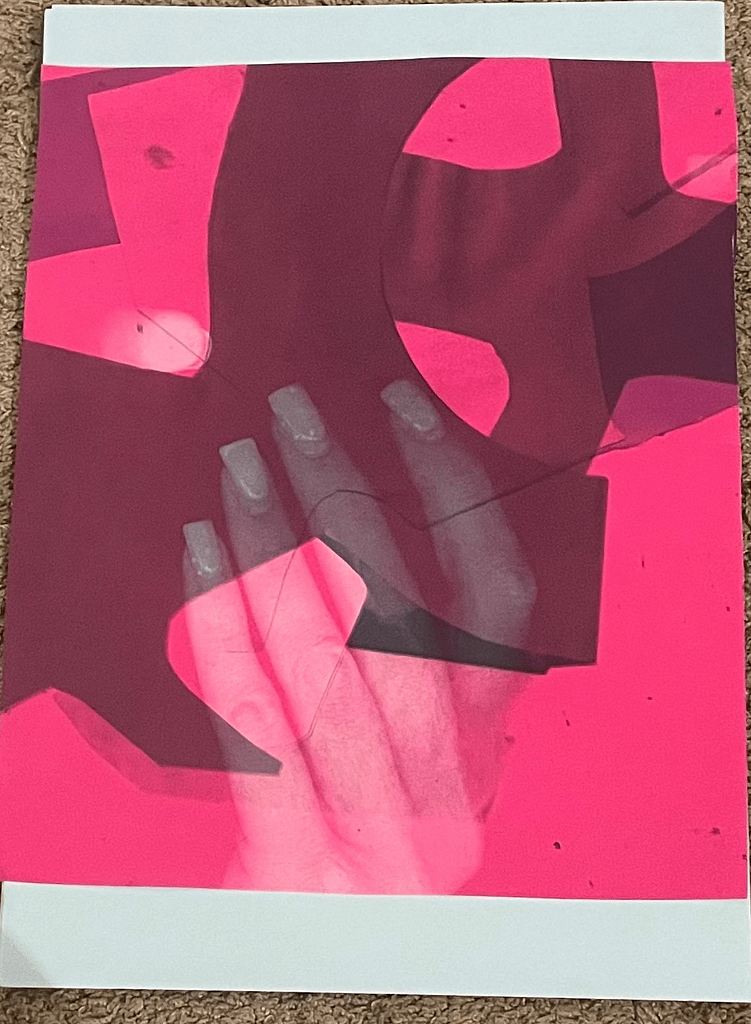
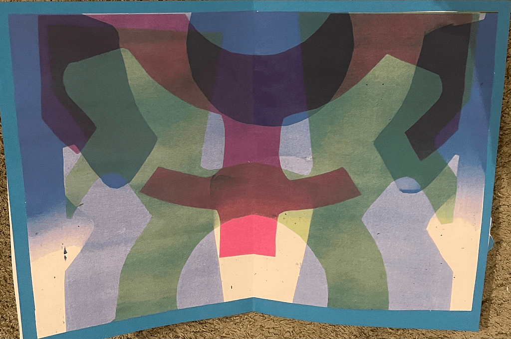
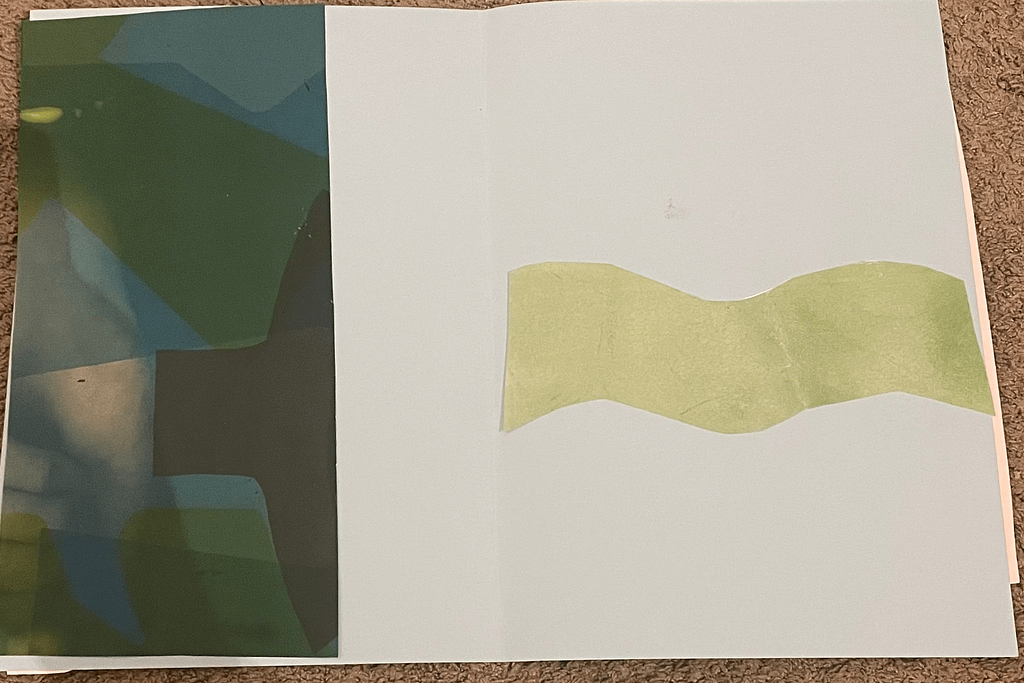
For this weeks lab spread I mostly made use of the copy machine, I tried out a bunch of different stuff with overlaying colours and patterns. The pattern is symmetrical because of the cutout I used you can see it below. We were only supposed to use colours but we tried to do something fun with adding hands under the scanner just to see what it would do. I think they’re good base compositions, although some of them could do with some more space across the page.
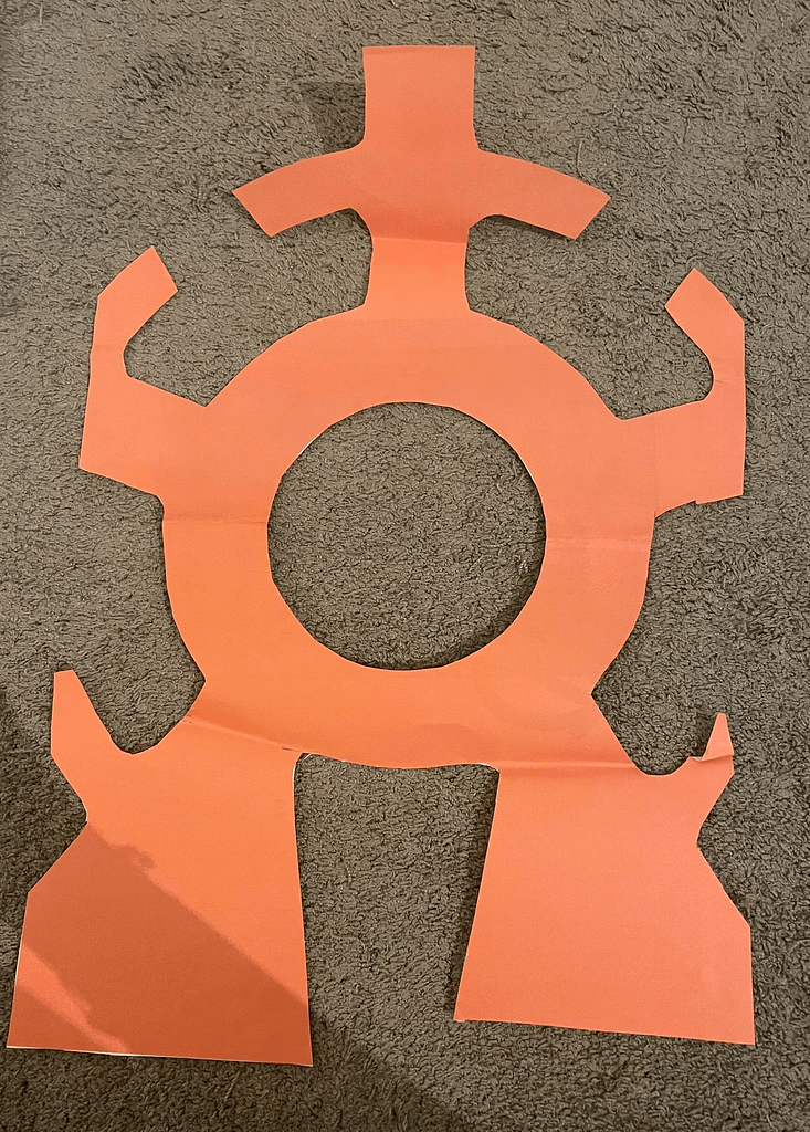
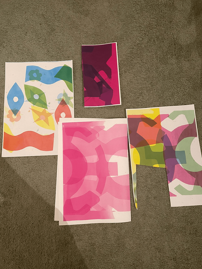
Here’s the cut out I used and some different pages we also did with the copy machine.
Photography
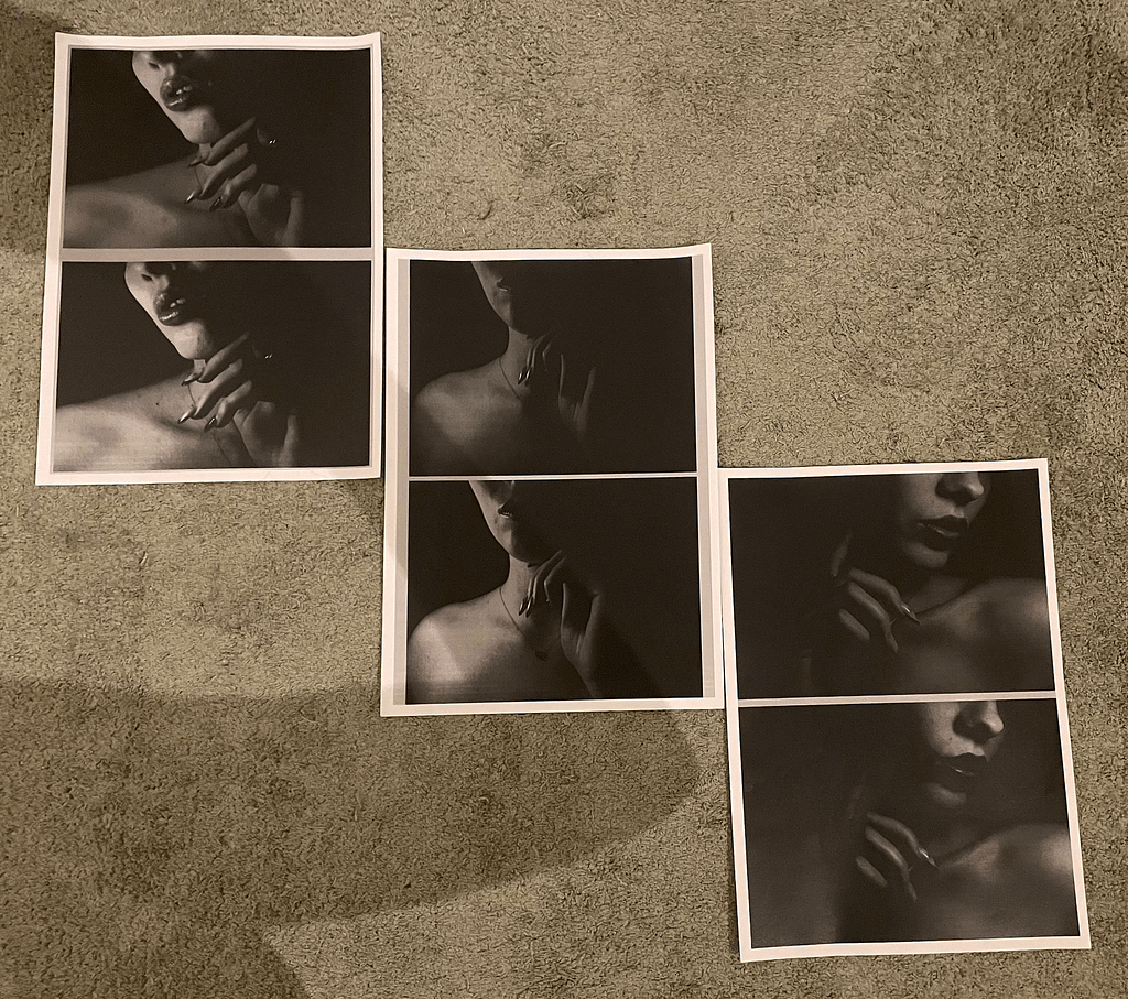
During the class we mostly talked about which 3 images we would pick to put in a triptych. While printing my pictures I put them on a grey background and put the 2 colour variants beneath each other to see the difference. I was planning on cutting them, but I really started liking the repetition (with the slight difference) and the way they were put on the page. They almost look like film roll. I decided to keep the white edges and grey background and treat each double picture as 1 picture. We shuffled the pictures around but this looked like the best option to me, I tried putting them all under each other as well, like an actual film roll, but I didn’t like it. We settled on this composition, with a sole title and no description. The pictures are mysterious and they will stay that way, everyone can think of a different meaning. I’d call the series ”Secrets in the dark” or something along those lines.
Pin hole pictures
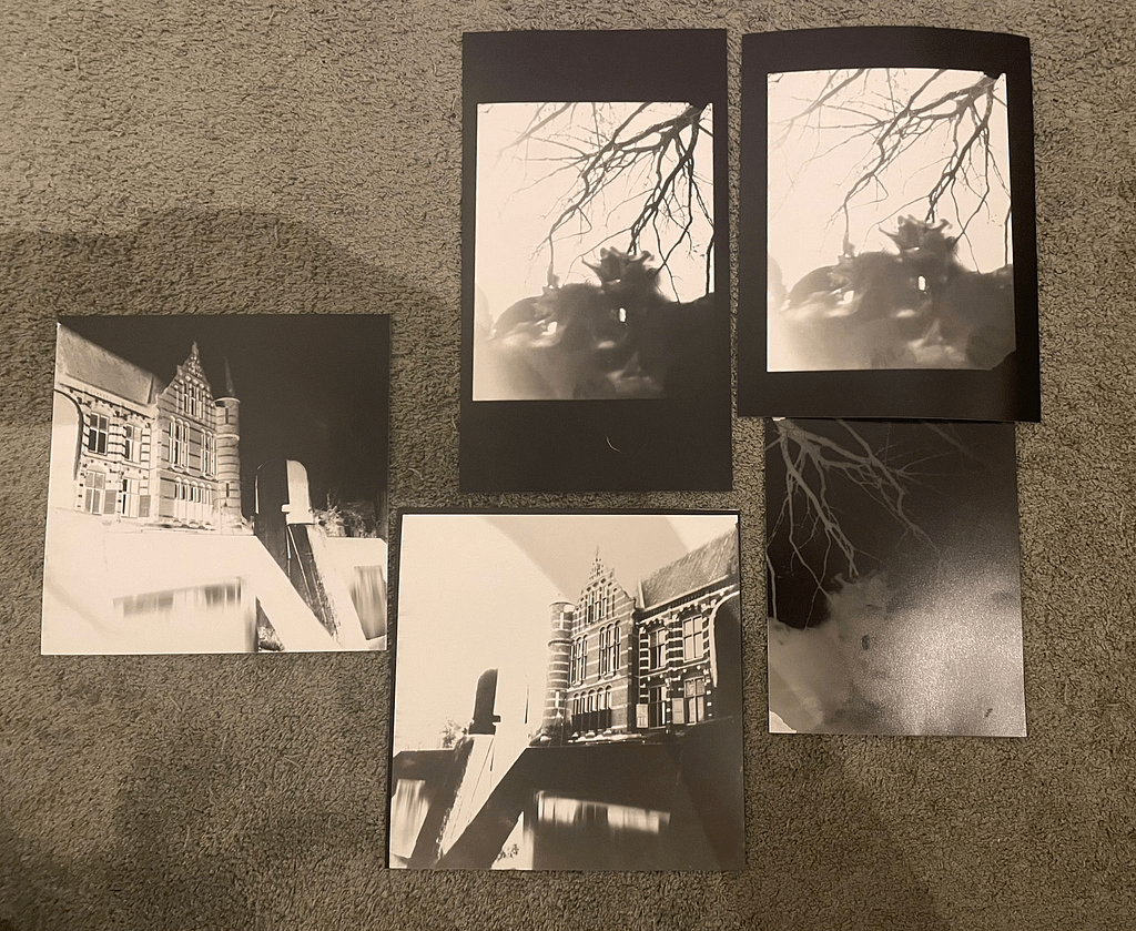
We also did some more pin hole camera pictures for the rest of the class, we also learned how to turn them into positive pictures using the material in the workshop, very good to know.
Overall assignment
More spreads, this time with colour
Spread 1

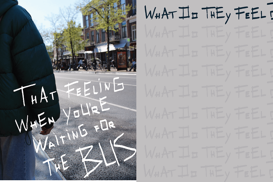
I really wanted to continue trying to incorporate handwritten words into the design so I just started trying some stuff out. The second page might still be a little too gray, maybe I can make it light blue instead? I’ll look into that at least.
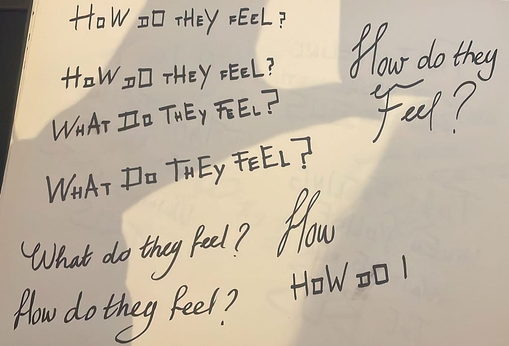
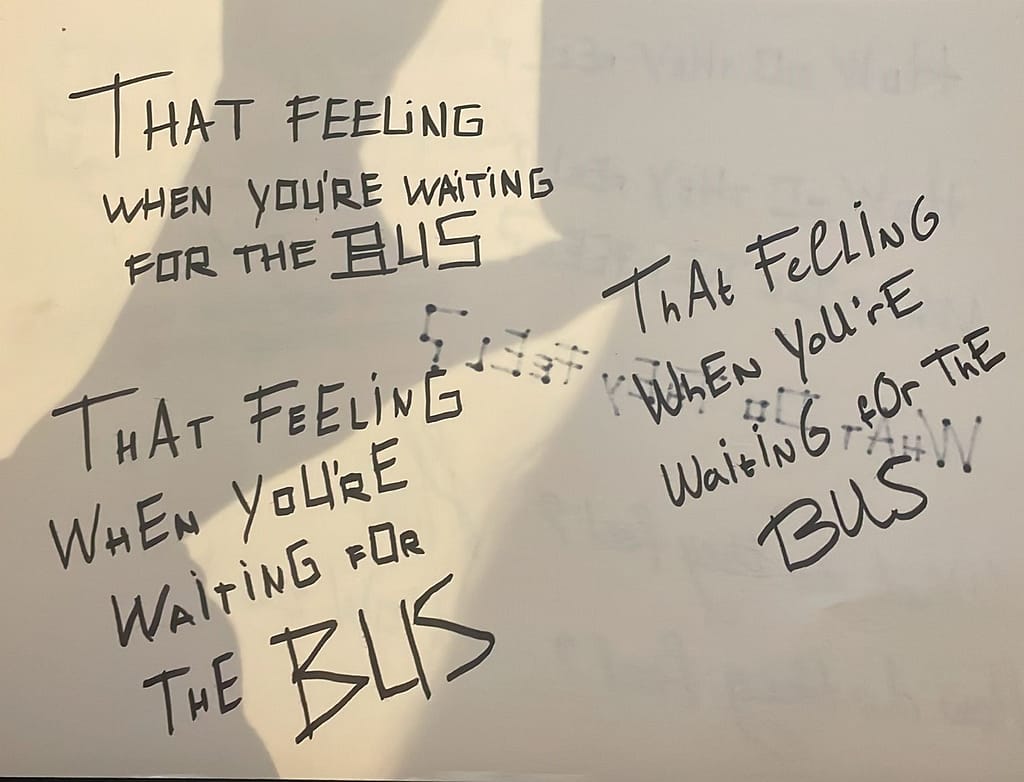
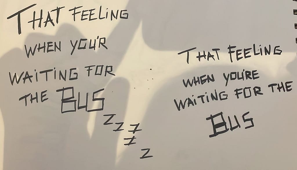
Eventually I picked these two.
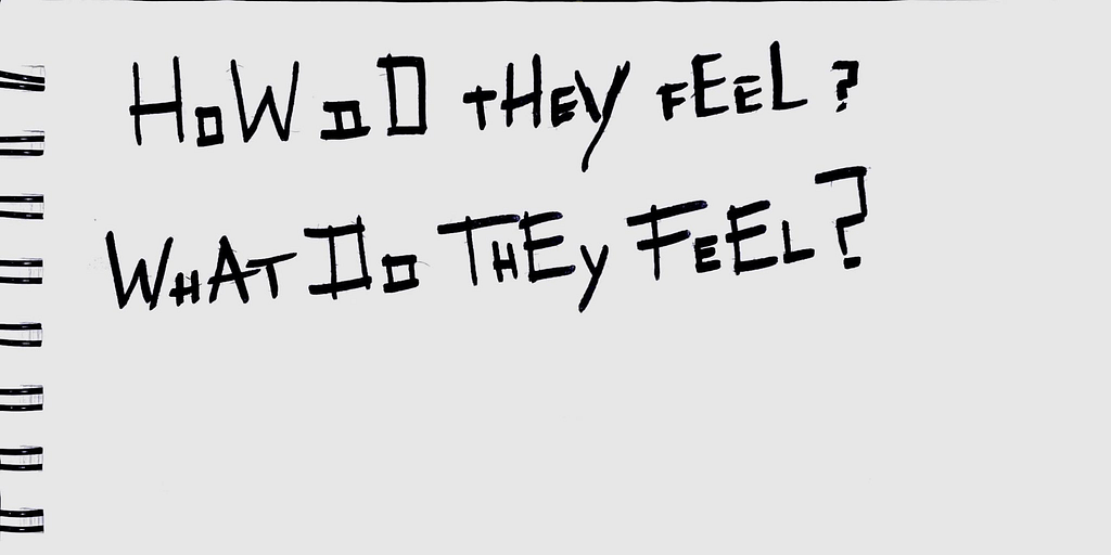
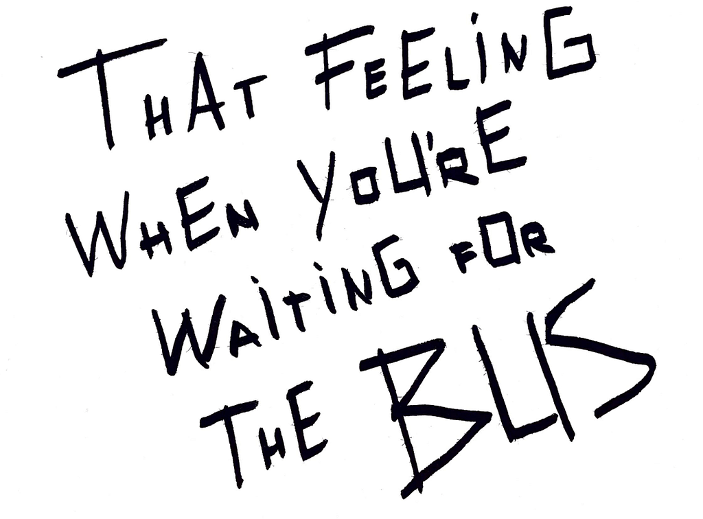
This would be the more subjective page for sure, I then wanted to make a page about the same subject but in an objective way so I tried to do that here.
Spread 2

Since the theme of this week is colour I tried to add a pop of colour in this design, I started with the picture on the first page and the orange was very prominent in this picture so I decided it would be nice to continue building around that colour. I drew a little stick figure to represent the people waiting here, but who are they really? I hope this will tie the pages together.
Since I want the second page to be informative I really want to photograph all sorts of people waiting at this particular spot, but I haven’t had the time to do this yet… the pictures you see are a replacement but the layout will remain the same I think. I want the page to just be about the people in the pictures.
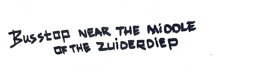
also a drawn sentence but I was actually really happy with my first draft of this one, so I used it.
Notes:
I really would like to use some images from the Groningen archieven, have to ask about them.