STUDIO : spreads
For both spreads i decided to focus on the restaurants logo(s) and i tried to reflect that in the designs as well. With the objective one i tried to find some info about why they chose to make their logos in specific ways (one for online marketing and a different one on their physical location). As for the subjective one i came up with my own iteration for their logo which and in the whole spread i tried to show the idea of connection and sharing.
LAB : main focus were colors this week, for the first two pages i added photos as well because i did not realize we couldnt use them.
THEORY : Ultimately i decided to go for the great wave of kanagawa as my research subject
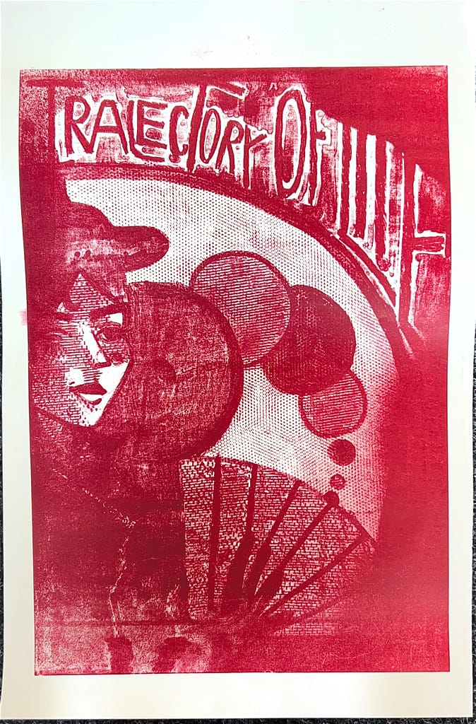
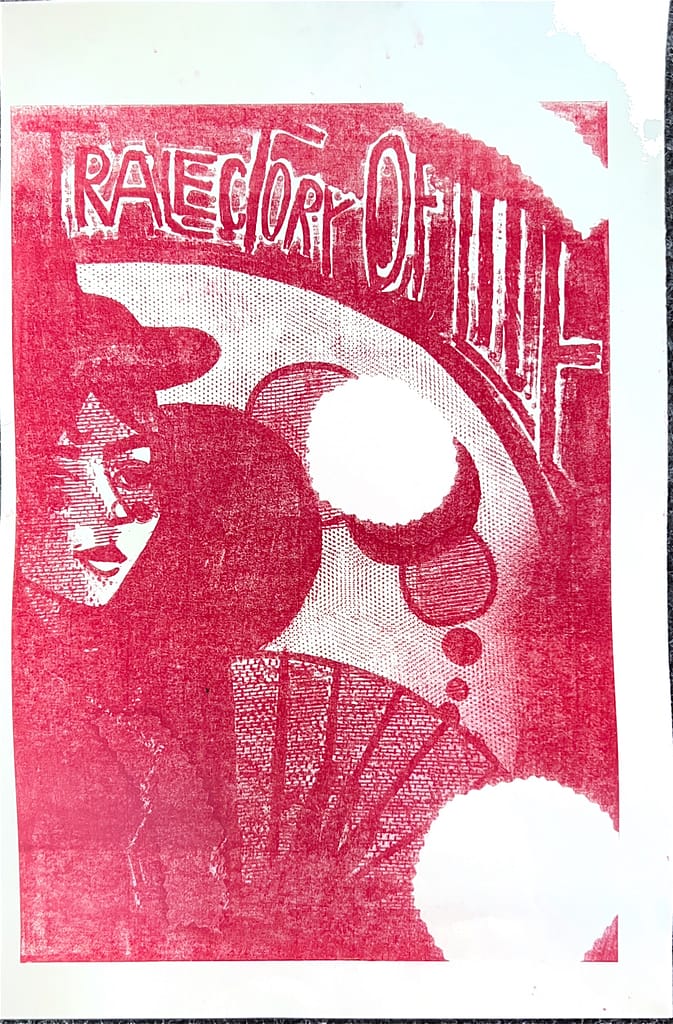
LITHOGRAPHY : prints
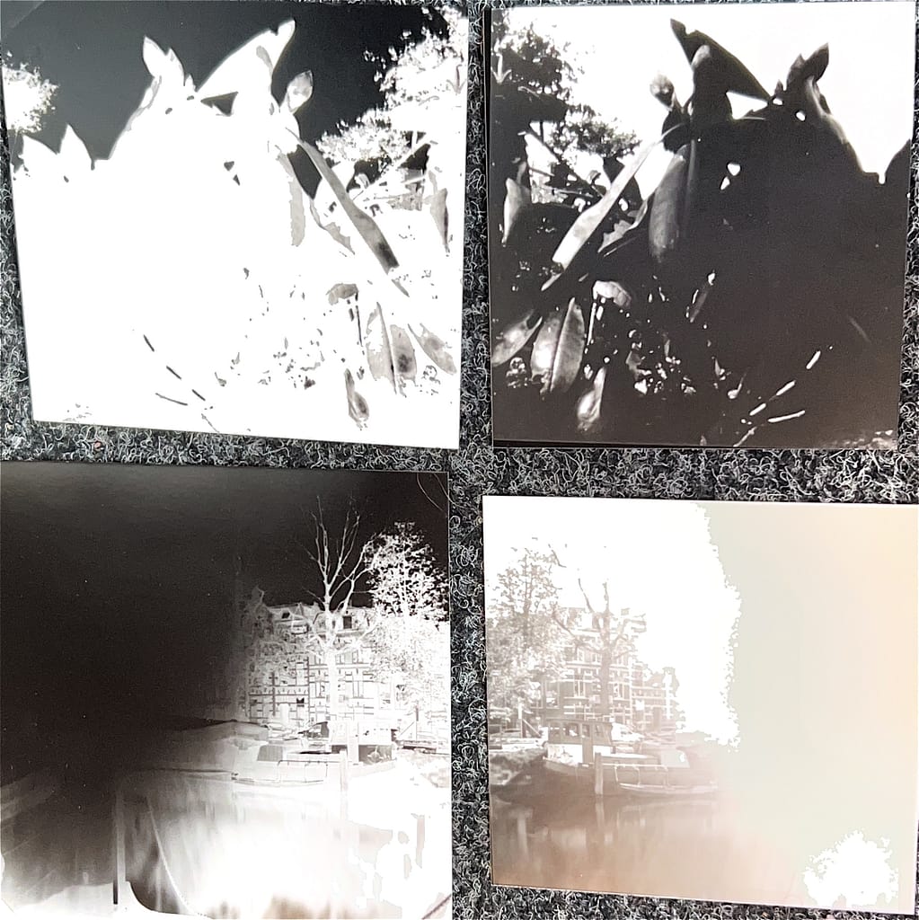
PHOTOGRAPHY : I probably like the flowers the most since they are the clearest photo i could take without any smudges in the way